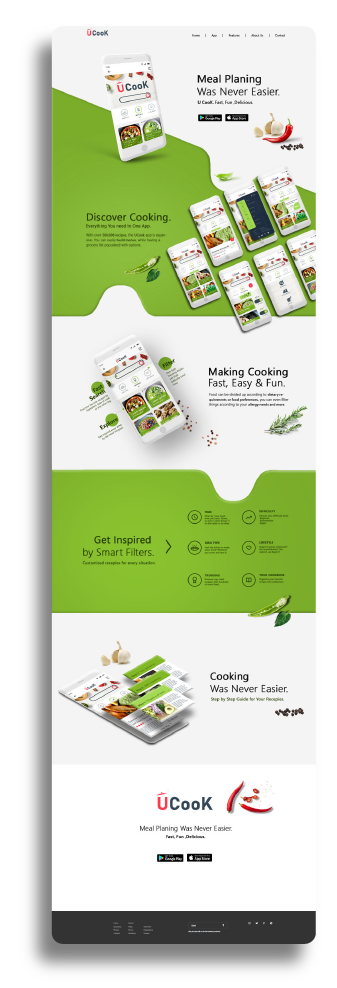

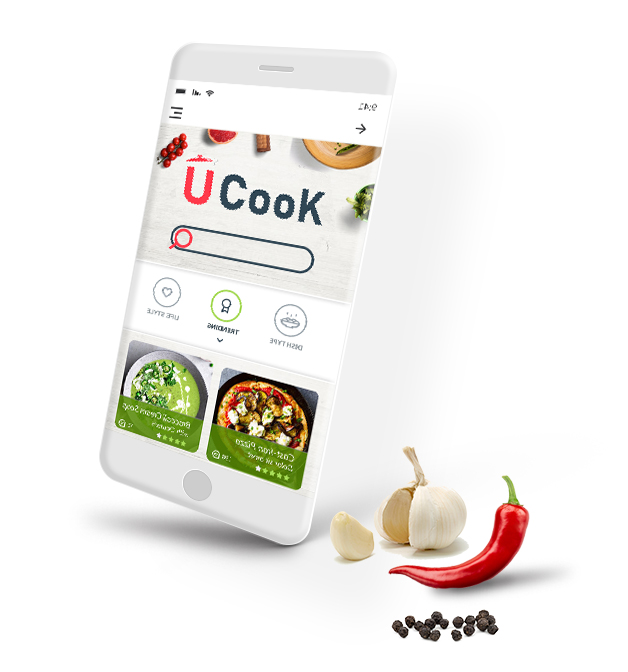
UX CASE STUDY
Everyone knows that feeling when you can’t decide what to have for dinner. All you know is that you want it to be something fast and delicious. Recently, on such an occasion, i thought – what if there was an app that could give you some tips?
For instance, an app that adjusts recipes to your cooking skill level. Or maybe finds interesting recipes based on what’s in your fridge. Why not let the app obsess about what to eat and not me?
My Objectives:
01. Define the users needs for such an app.
02. Think about ways for your product to meet those needs & build a prototype which will test those ideas.
03. Implement resulting concepts in a final project.
I used this design thinking approach for all these steps:
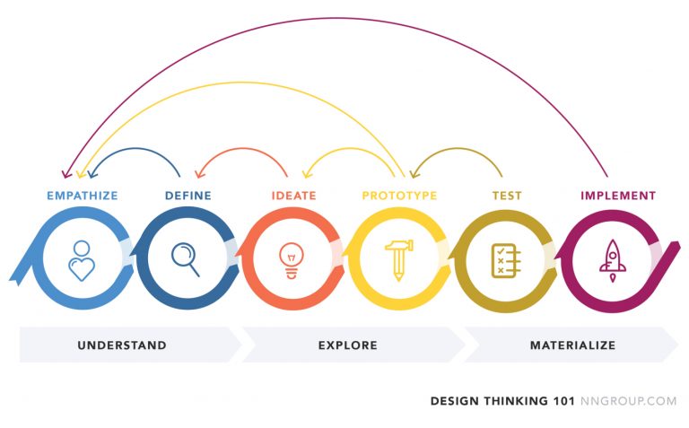
PROCESS
Understand
- User Interviews
- Persona
- User Stories
Explore
- Wireframes
- Userflow
- Prototipyng
Implement
- User Testing
- User Interface
- Final Product
01.
UNDERSTANDING
RESEARCH & EMPATHIZE
My premise is to start any ux concept with “Why” in order to clearly understand the users needs and expectations regarding the app.
Objective:
Define how often the users find themselves in a situation when they don’t know what to cook.
Define how they solve this problem.
Specifically asking the costumer what they want is rarely the best way. The right approach is to asses their needs and to observe their process of reaching their target. This helps me not only to recognize the users goals, but also offers me an understanding about the most efficient way to reach those goals.
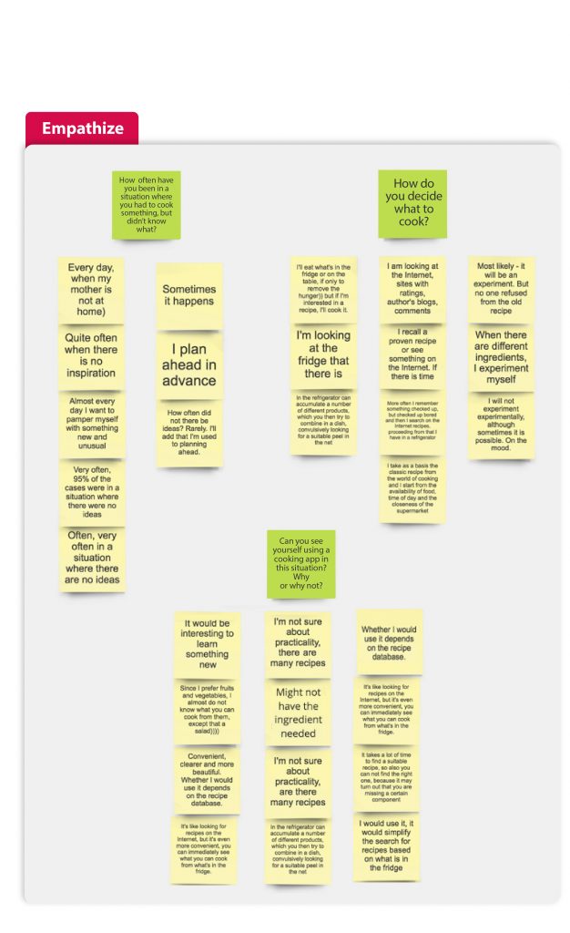
DEFINE NEEDS & PERSONAS
After analyzing the results from the previous interview session I conducted, I defined the users similar behaviors and pain points.
So I’ve got 3 main functions that are crucial for users:
01. Improving cooking skills.
02. Searching for recipes by individual parameters (like lifestyle, difficulty or duration).
03. Being able to save & share ones favorite recipes.
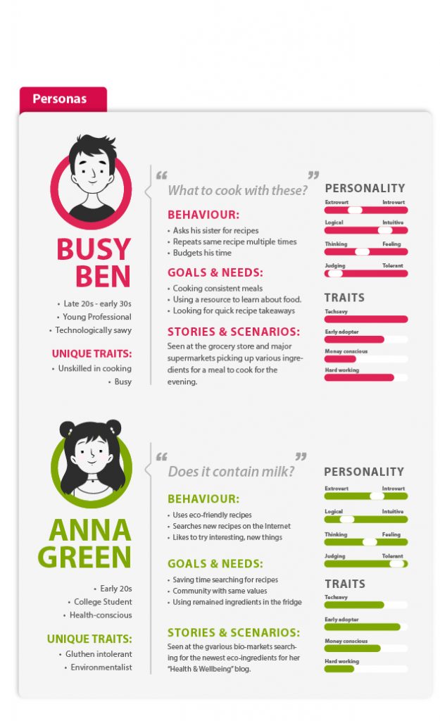
Next I created a set of User Personas based on this research. Personas are invaluable in determining the proper functionality of the app, as well as formulating a strong basis for the final User Flow.
I concentrated on 2 main types of target users— people who don’t have enough time or experience to cook and people who need a defined range of ingredients based on their lifestyle.
user stories & red Route
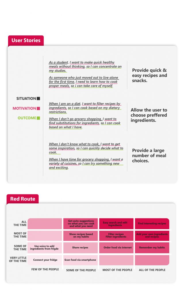
Personas help you understand for whom this product is created for; user stories help you focus on their needs and the context of use. As I’ve defined the main users’ needs, I can now create user stories.
I used a red route approach to highlight personas main habits. It helped me focus on the key features of the app which users actually need.
I asked the participants to rate factors by frequency of use and significance. Then created a graph according to the level of usage and number of people using them. Mapping the red routes helped me find out which features are most relevant to users.
02.
EXPLORING
Information Architecture & USERFLOW
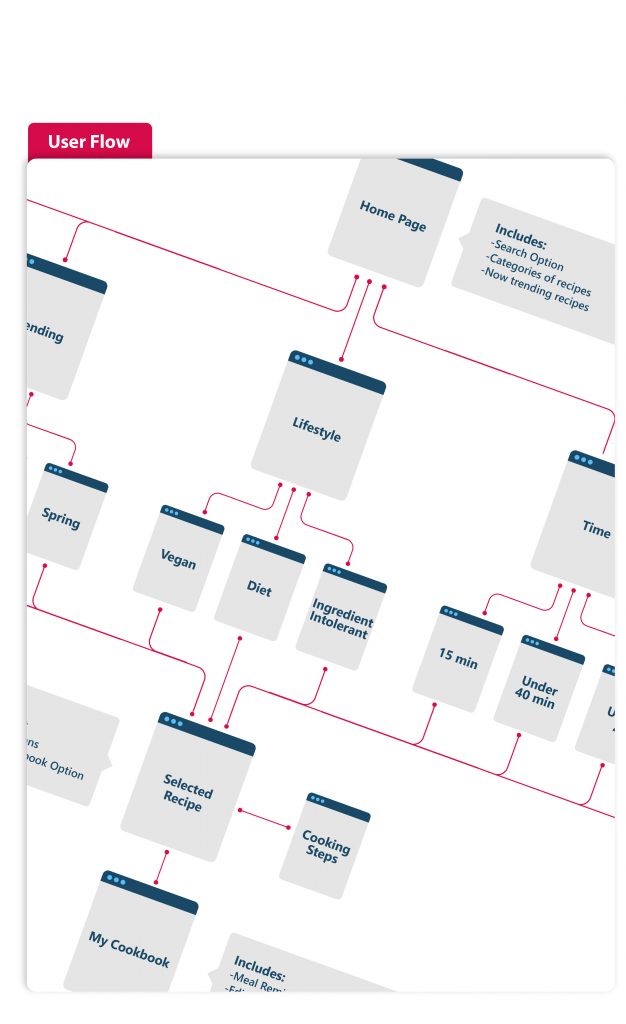
The way the content is organized is just as important as the content itself. The app’s success lies in helping the user navigate a sea of information in a fast and easy way. The best way to achieve this is by decreasing the user’s cognitive load.
According to the LATCH method information can be organized in 5 ways — by Location, Alphabet, Time, Category and Hierarchy.
In our case the basic user flow is very simple — you either use the search bar with autosuggestion and autocomplete for fast and relevant search; or you use the apps menu where you find recipes based on different criteria (Dish Type, Lifestyle, Trending) and hierarchy (Difficulty, Time of Cooking, Rating).
WIREFRAMES & COMPETITOR ANALISYS
For me, one of the most important steps in a case study is researching competitor apps and determine what makes each successful.
By studying four successful apps in the food recipe genres (Tasty, Yummly, Food Network, HelloFresh and BigOven) I was able to narrow down specific traits and functionalities inspiring similar features within Ucook, allowing me to provide the user with a unique experience within the expected parameters of a mobile app
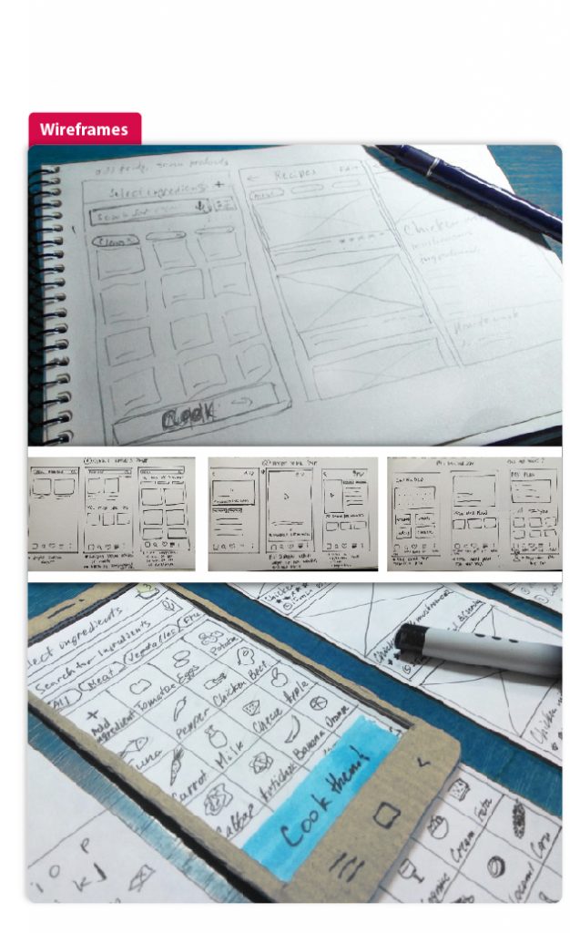
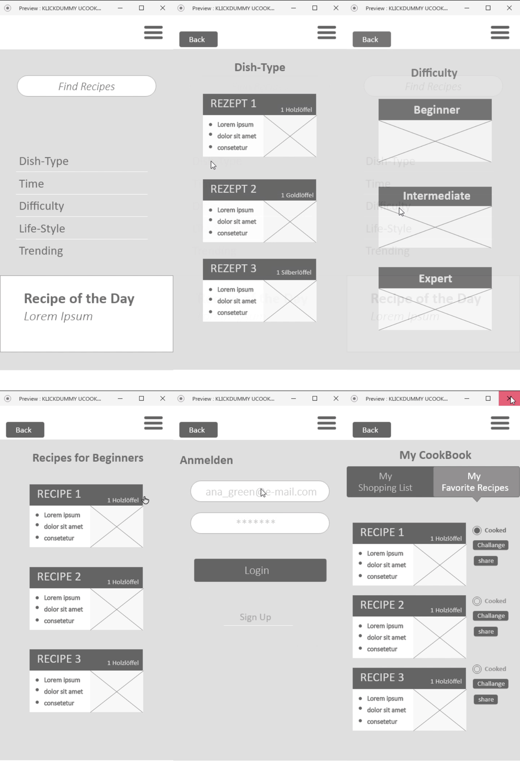
Once I have the knowledge I need from other leading apps, the User Flow previously created evolves quite organically into my low-fidelity wireframes.
Creating a rough paper prototype to test my ideas is a great tool to quickly do a first test of the app’s navigation and workflow.
USER TESTING & PERFECTING
Next I created a rudimentary digital prototype. Then conducted a user testing to validate my ideas.
To test our early prototypes, we gave users scenarios and tasks we wanted them to achieve.
Here is an example of such task: “Imagine that you are a student; new to cooking and sick of instant Ramen. You decide to try something new. How would you decide what to cook using this app?”
I asked the participant to speak aloud while performing the task. The feedback was critical to determine whether my app was intuitive and easy to use.
I noted all my observations and defined the issues I had to solve.
03.
IMPLEMENTING
STYLE GUIDE & INTERFACE DESIGN
With ever-increasing number of cooking apps, the first impression cannot just be “nice and clean”.
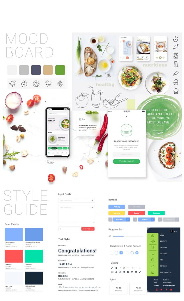
In this case, the app needs to instantly appeal to the emotional side of user experience. As the app is aimed mostly at young newcomers to the world of cooking, the design should adopt a light and playful theme, but also evoke a healthy and fresh feel.This is the balance the app’s interface is looking for.
Here is where the moodboard comes in. Gathering suitable UI inspiration conveys a general picture of the overall mood and style of the app .
Clear and solid typography based on san-serif fonts makes the text scanable and legible.
The layout needs to be intuitive. Light background, eye-catching visuals and color contrast, amplify a quick navigation. In conclusion, for it to succeed, the product has to be attractive from the get-go.
PROTOTIPYNG & PERFECTING
This is where the fun begins! Now that i have a first raw shape of the product, I can finally start working on the user interface in detail. Now i can stop learning and start thinking!
Through a iterative process I digitally optimized the sketches into high fidelity wireframes.
After reviewing the test results, I used Adobe XD to render a new version of the prototype with my results included. Among others, his software has an amazing feature — it lets you see the connections between the displays. It’s a good way to improve your product’s navigation map.
FINAL PRODUCT & PRESENTATION
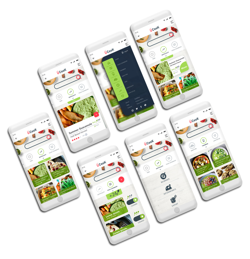
I put in perspective all the findings and testing results to create a light and clean UI that will not distract users from their goals.
Slight elegant animation during the first interaction instantly appeals to the emotional and aesthetic sides of user perception. (When it comes to the consumer, the first 5 seconds using the app are crucial.)
The category field is easily found on the top of the screen: its functionality is clarified for users with both icon and text prompt.
The light and airy background sets the effective space for a variety of photos and graphics that may come with the recipes. Bright color accents attract users’ attention to interactive zones and active states of the layout elements.
The app is simple to use, engages the user from the first seconds and lets them interact according to their personal preferences.

Discover Cooking. Everything You need In One App.
With over 500,000 recipes, the UCook app is expansive. You can easily build menus, while having a grocery list populated with options.
